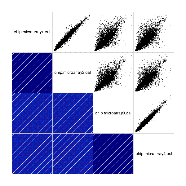
Creates a correlogram for a normalized dataset.
Correlogram visualizes the pairwise correlations of the samples. The upper triangle of the plot consists of pairwise scatter plots. The lower triangle visualizes both the direction of the correlation using thin lines inside the colored boxes, and the magnitude of correlation using the colors. The darker the color, the higher the correlation.
You can choose whether you want the output in PNG or PDF -format. The default is PNG, as the PDF image might be really large and thus it can take a long time to draw. If you choose the PDF, it is advisable to export (File -> Export datasets or folder...) the image for closer examination.
A PNG or a PDF image containing the correlogram: