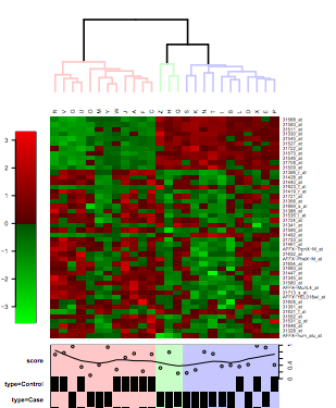
Visualizes the grouping of samples or genes as a static heatmap image. If you would like to have an interactive heatmap which scales well and allows to select genes, please run the tool "Clustering / Hierachical" and double-click on the result file hc.tre.
First both samples and genes are clustered using the chosen distance metric and agglomeration method. These clusterings are then visualized as a heatmap, where every gene is colored according to its expression level. Please note that while this tool can be applied to a dataset containing up 20 000 genes/samples, the text doesn't scale accordingly. For large datasets it is recommended to use the "Clustering / Hierachical " tool instead.
Sample annotation information can be added by setting the phenodata column to something else than EMPTY. Currently, sample information such as annotation or experimental group and mean values can be added to plot.
The tool also automatically splits the tree into a specified number of groups, and visualizes the dendrogram leading to these groups with different colors, if number of groups is set to something higher than 0.
A pdf file containing the heatmap: