In this tutorial we will go through the following steps using Illumina gene expression data:
The dataset consists of two kinds of sperm cell samples. Five of the samples are normal sperm, and eight are from teratozoospermic individuals. Teratozoospermia is a condition where most of the sperm cells are severely malformed. The aim of the study is to identify the genes that are differentially expressed between these two different sperm types. The data set used in this tutorial is available from the GEO database with accession number GDS2696.
The Illumina data is stored in separate files in GEO. One file represents one sample. Put all the datafiles in the same folder on, say, Desktop. In practise, it is easiest to read in a whole folder at the same time.
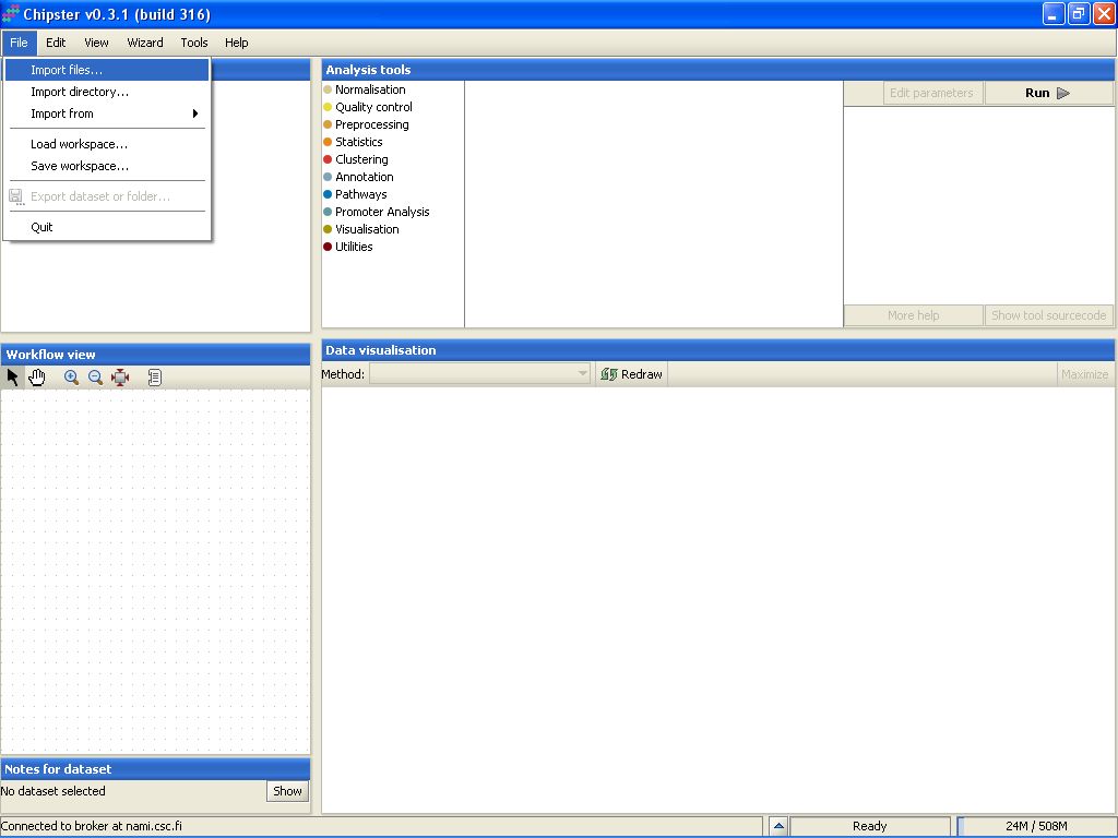
To import the files to Chipster, go to menu File, and select Import Files:
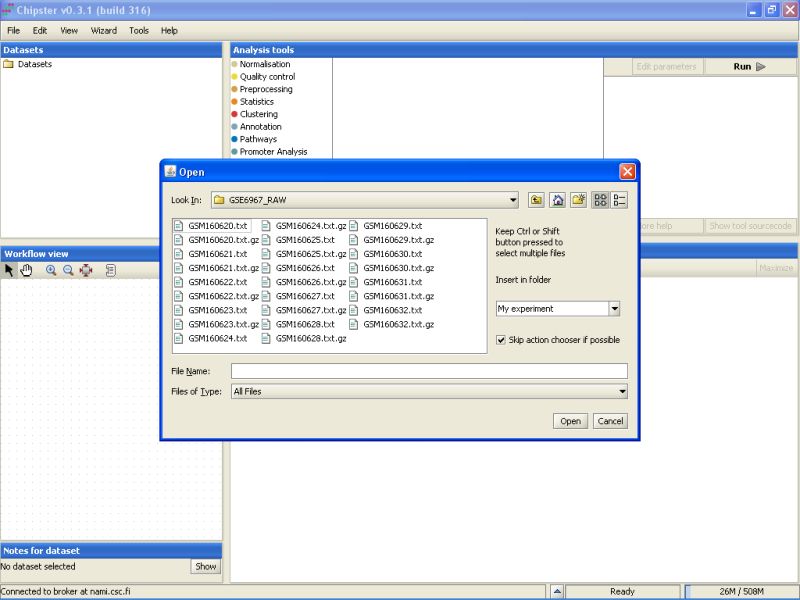
Browse to the folder where the data is located:
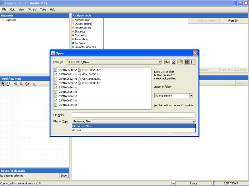
There is a mix of .txt and .gz files in the folder. To display only the txt-files, select Microarray files from the drop-down menu in the Open dialog box.
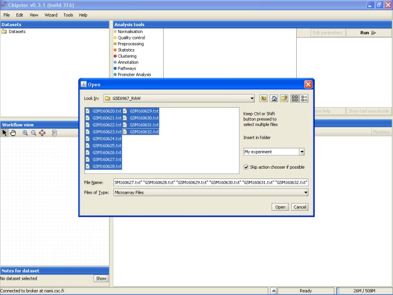
Select all the files by clicking on the first file, and the last file while keeping the Shift-key pressed down. After selecting the files, click on the button Open to start the data import:
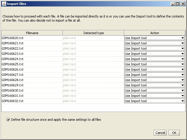
A new window opens, which allows you to define the actions performed for each file. You do not need to change anything, so click on OK.
Import Tool Opens.

Click on the 'Mark title row' button on the top.
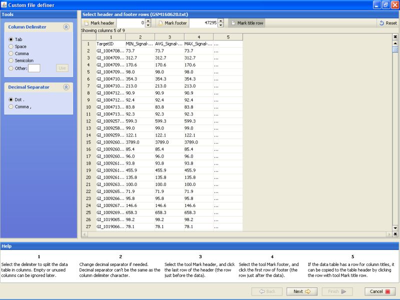
Click on the title row on the table below to mark it. This just tells the program that the first line of the file contains column names. These column names are then used to identify the column in later stages of data import.
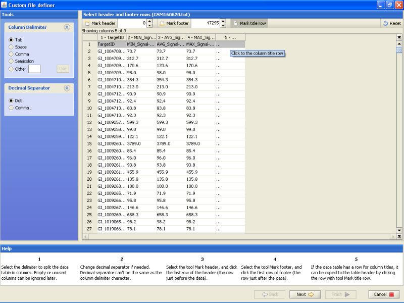
After marking the title row, click on the Next button on the bottom. This will get you to the next stage of data import.
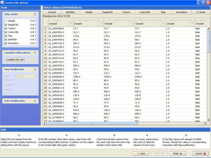
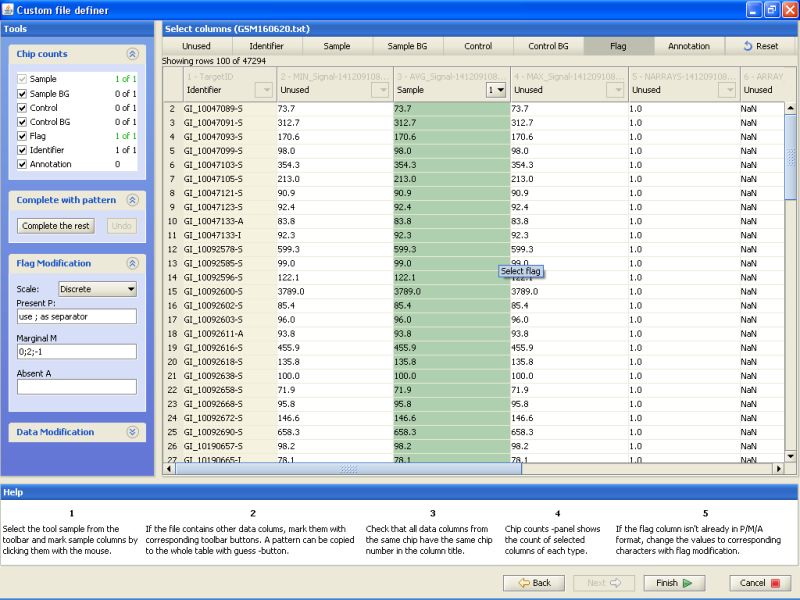
Notice the buttons on the top row. For the current data, you would need to label at least one column as Identifier and another column as Sample. In addition, one column could be labeled as flag, and it can be used for automatically generating flags during the normalization phase.
To label a column, click on the button on the top row, and then the column in the table below. First label column TargetID as Identifier. Next, label column AVG_Signal as sample. And last, label column Detection as Flag. All other columns should remain unlabeled:
After this you've completed the data description phase, and can import the files to Chipster. Click on the Finish button to accomplish this.
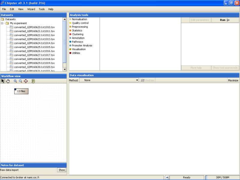
Once the data has been loaded, you'll see a list of 13 files appearing under the Dataset view. The same set of files is also represented by a grey box with a text '13 files' appering in the Workflow View:
The next step would be to preprocess and normalize these data.
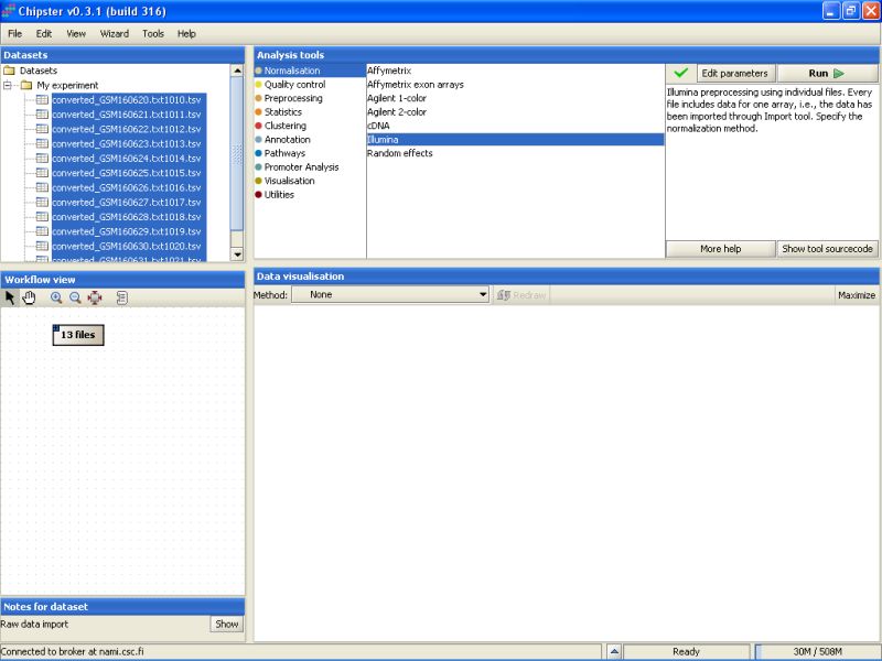
Click on the grey box representing the files in the Workflow view. This selects all the files:
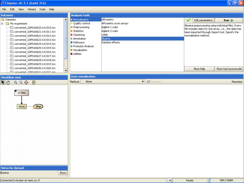
Next, go to the Analysis tool list, and select the category Normalization. You'll see a list of preprocessing and normalization tools appearing:
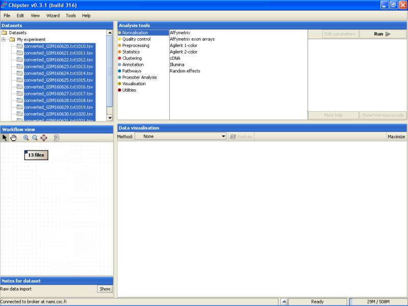
Select the Illumina tool:
To view the current settings and to modify them, click on the button Edit parameters in the top-right of the Chipster window. A list of parameters appears:
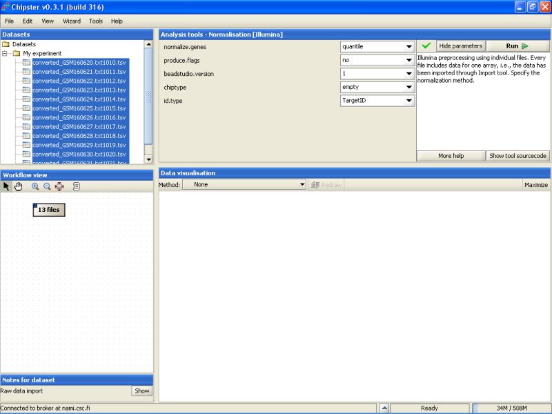
The current settings need to be modified to suit this data. As the Detection columns were exported from the Import Tool, we can calculate flags for all genes. Change the setting Produce Flags to yes. In addition you need to specify the chiptype. For this dataset it should be changed to Human-6v1.
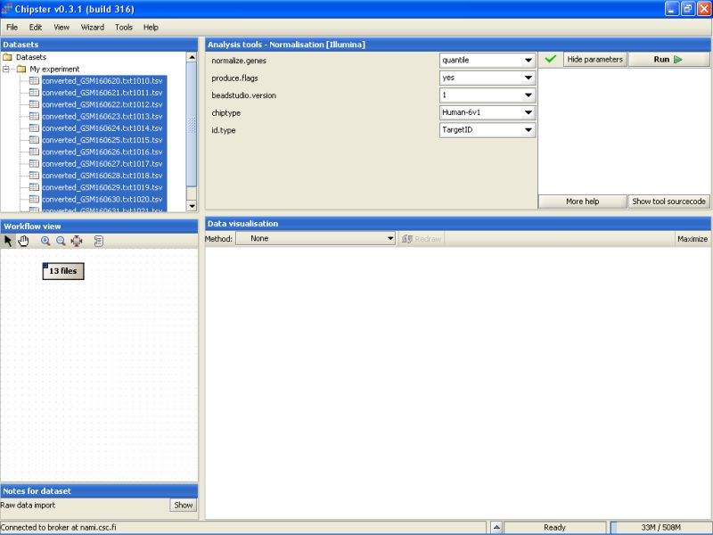
After that press the Run-button to start the tool. A moving blue bar appears on the bottom of the Chipster window to indicate that a job is running:

It takes a couple of minutes to run the preprocessing and normalization, but once the results are ready they will appear under the Datasets and Workflow view. The normalized data set appears as a yellowish box in the Workflow view:
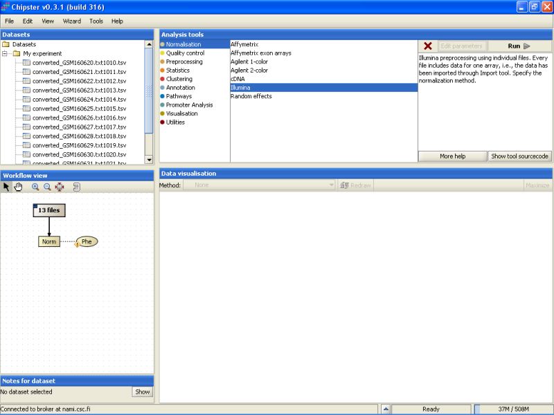
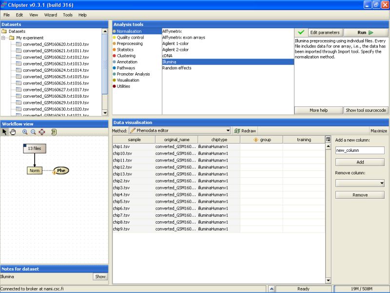
Before any real analysis, the phenodata of the dataset should be filled in. Phenodata is a description of the experiment - what are the important questions that should be answered. Note the yellowish blob appearing next to the preprocessed and normalized data set in the Workflow view - it is the phenodata. Click on the blob to select it:
Go to Data Visualization, and from the drop-down menu select the Phenodata editor:
This opens the Phenodata editor, where you should fill in the group column. Because the comparison of normal sperm to malformed sperm was of principal interest in this experiment, we'll use the knowledge of the sperm type to fill in the group column. All the samples from normal sperm are coded with 1, and the samples from abnormal sperm with 2:
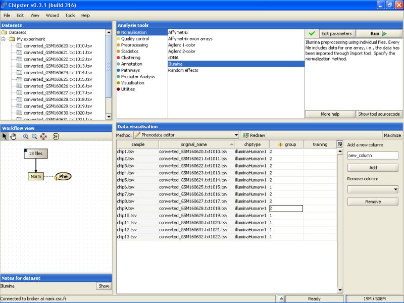
Once the phenodata column group is filled in, the exclamation mark disappears from the phenodata blob in the Workflow view:

Now you're ready to run some analysis.
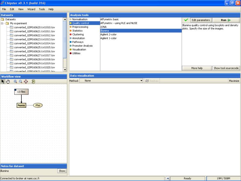
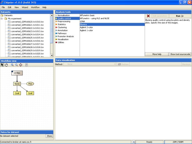
Illumina quality control is typically run on normalized data. To make the basic quality checks, select the normalized data in the Workflow view, and use Illumina -tool from the Quality control category:
It takes a few minutes to complete the quality control analysis. Once the analysis is ready, two new yellowish boxes appear under the Workflow view:
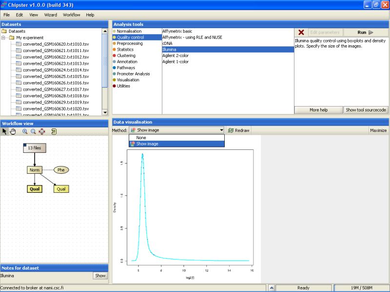
Select the left Prep-labeled box, and select Show Image from the visualization drop-down menu. A density plot for all chips appears. After quantile normalization all chips have almost exactly the same distribution of expression values, so the image is not very interesting.
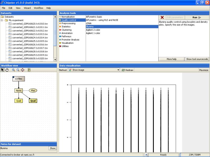
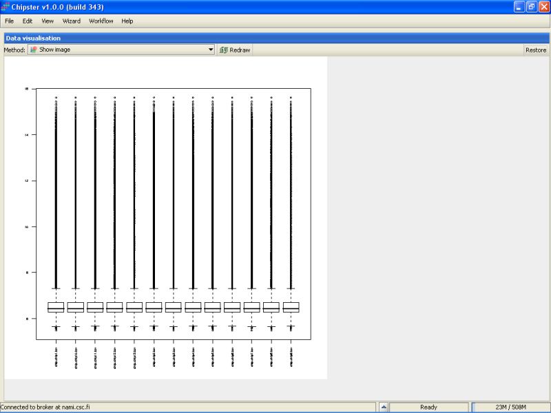
The same applies to the box plot generated from the normalized data. That's the right-most Prep-box. To view the image in its larger form, click on the Maximize button on the top bar of the Data visualization area:
To get back to the original view, click on the Restore button on the top bar:
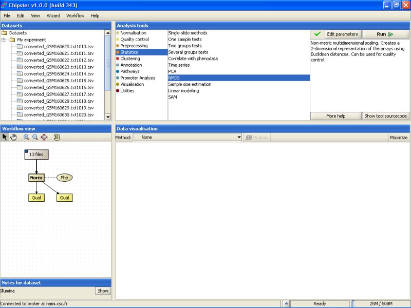
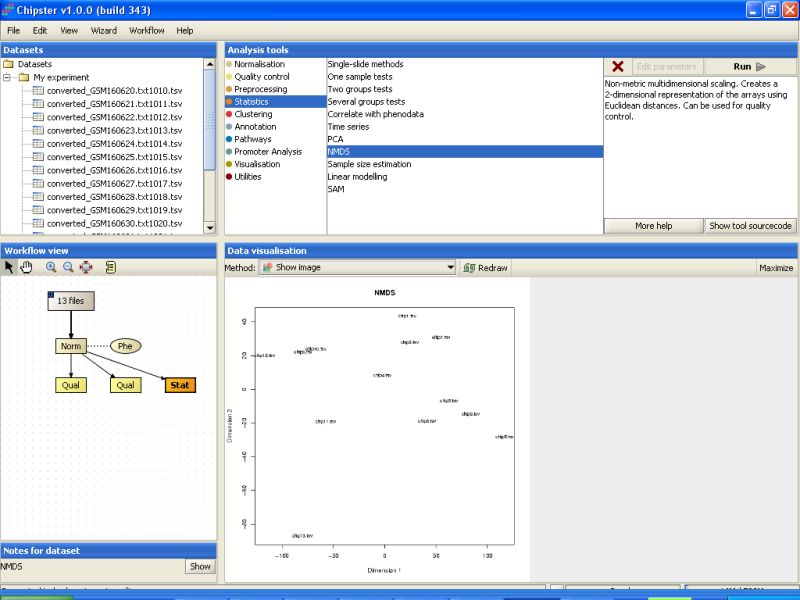
There are several more ways to quality control the normalization of the data. One of those is non-metric multidimensional scaling. It's located under Statistics category with the name NMDS. You don't need to modify any parameters, so just run the tool:
Then visualize the result (the orange Stat-box). The relationships between the chips are visualized in two dimensions in the NMDS plot. Notice the sample 13 that seems to deviate from the others especially on the Dimension 2 axis.
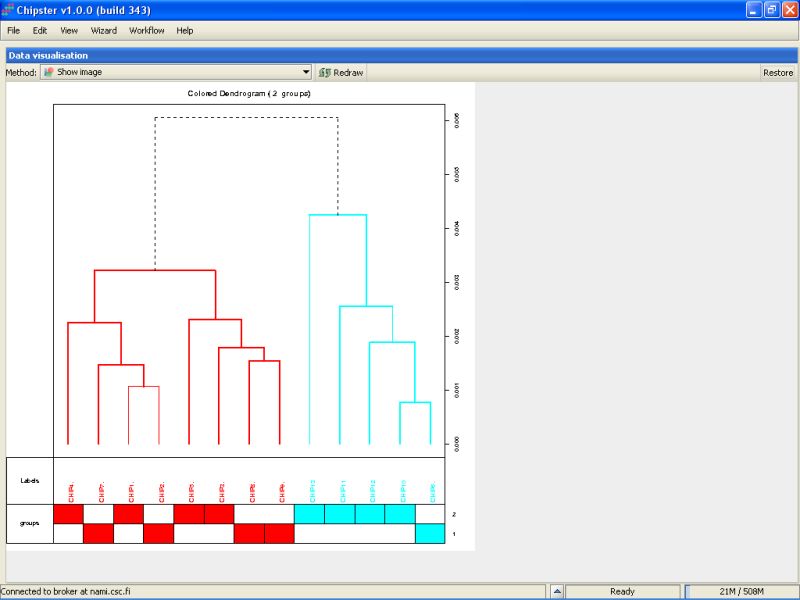
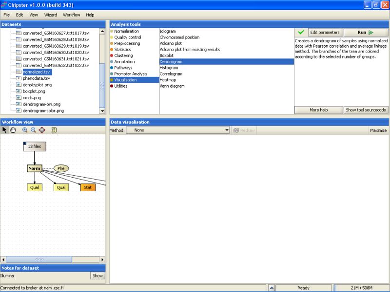
We can check the quality also by using hierarchical clustering. There is tool Dendrogram under the Visualization category that does exactly that. You should modify the parameters to cluster chips, not genes. After the run is ready, visualize the color-image. It is easy to see that the two groups are not easily differentiated on the bases of all genes. The colored bar on the bottom tells each samples group. The ones colored with blue are mostly group 2 samples. The sample 13 is the most distant from all others, but not maybe deviation enough to warrant its removal from the dataset.
So we keep all the samples in the analysis, and move on to filtering.
To filter the non-changing genes, select the normalized data set under the Workflow view:
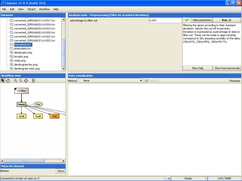
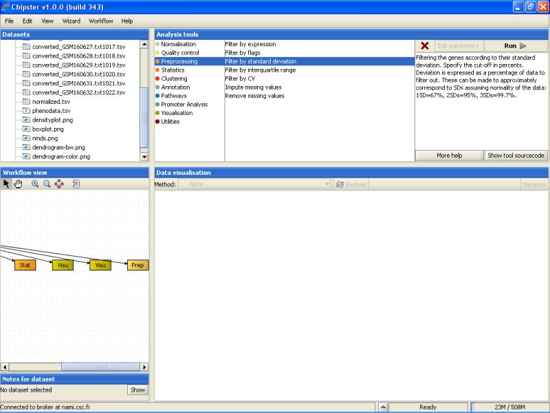
One way to filter out the non-changing genes is to use filtering by standard deviation. The genes that show the lowest standard deviation are those that are not displaying much changes between the normal and cancerous tissues. To filter the genes based on standard deviation, go to the tool category Preprocessing, and select the tool Filter by standard deviation:

By default the tool filters out 99.7% of the genes:
After the filtering, a new data set is returned (the new Prep-box):
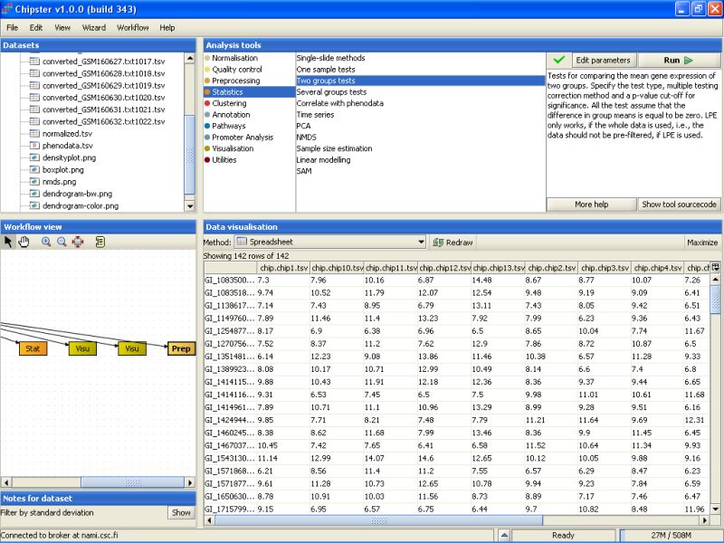
To see the genes that were retained in the filtered data, select the data set, and select Spreadsheet from the drop down menu under the Data visualization.
The data is displayed as a spreadsheet, and the top row of the visualization says ' Showing 142 of 142 rows', so 142 genes were retained after the filtering:

This filtered data can then be used for statistical testing.
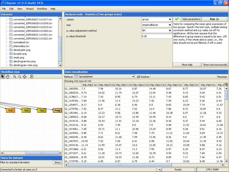
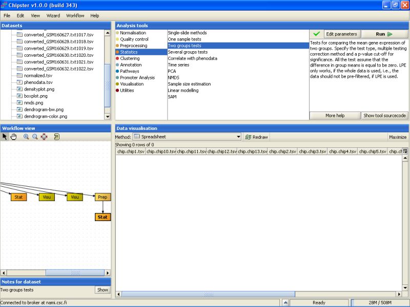
There are two groups in the data: normal sperm and abnormal sperm. The correct statistical test is the one intended for two groups. To run this kind of test, go to the tool category Statistics, and select the tool Two groups tests:
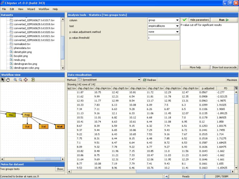
By default, the tool uses an empirical Bayes t-test for comparing the groups. This is a more sensitive test than the standard t-test, and hence preferred. In addition, Benjamini and Hochberg's false discovery rate is used for correcting for multiple tests, and a false discovery rate of 0.05 is used. It is advisable, at least initially, to run the test using these settings:
After the analysis has finished an orange box appears in the Workflow view. If it is visualized as a spreadsheet, it becomes apparent that 0 genes passed the statistical test:
After testing a few more settings, it fast become evident that most of the genes are not statistically significant at the usual level (0.05). So, we can calculate a p-value for every gene in the data set by setting the p-value to 0, and turning the multiple testing correction off. This should return 142 genes in the new dataset:
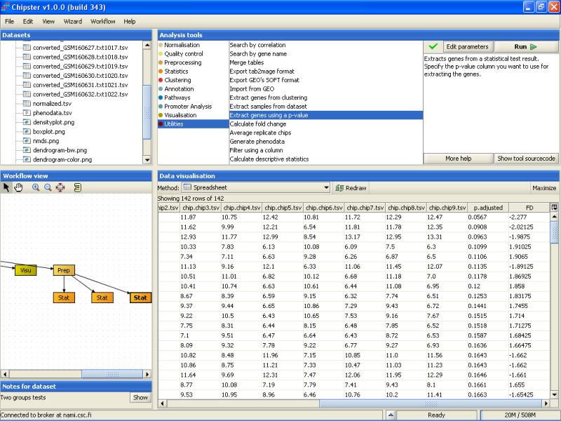
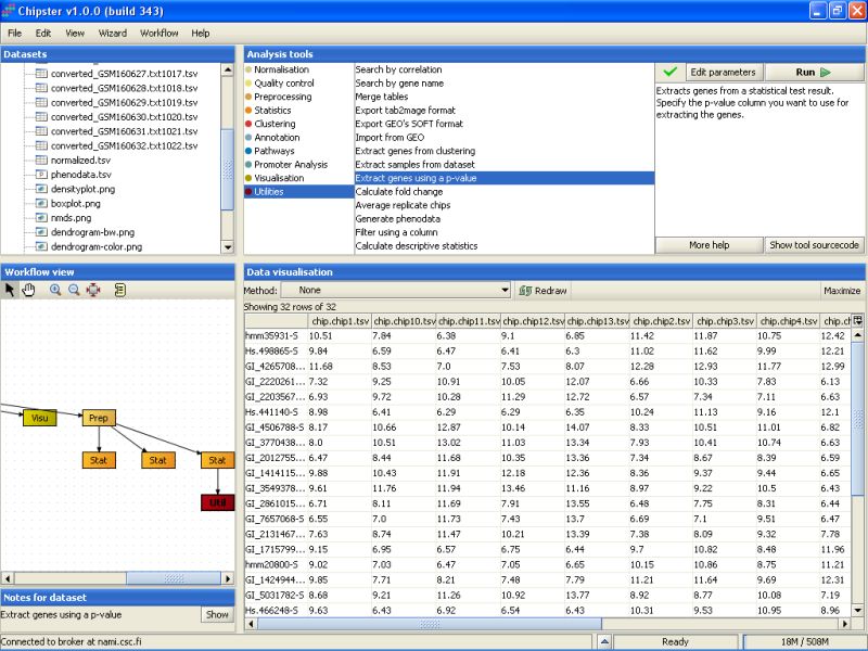
The second to last column noew lists the un-corrected p-values for all genes. To retain only the genes that have a p-value of 0.2 or higher, we need to run the tool Extract genes using a p-value. It is located under the Utilities category:
Modify the settings so that the p-value threshold is 0.20, and the column that contains the p-values is the p.adjusted column in the selected data set. Then run the tool:
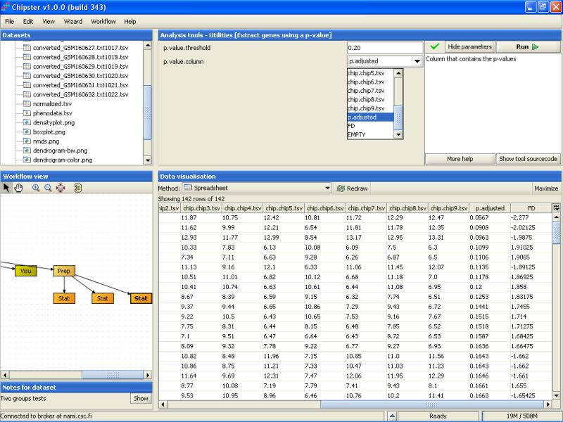
P-value filtering returns 32 genes:
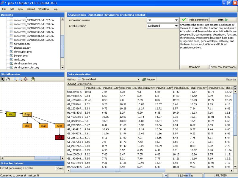
Next, the 32 selected genes are annotated. To annotate the genes using the default Illumina annotations, select the tool category Annotation and the tool Affymetrix or Illumina gene list:
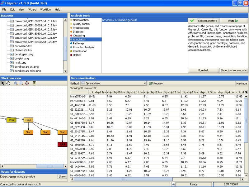
You can change the settings of the annotation script to include one column to display the p-values of the genes and another one to display the fold changes of the genes between the two tissue types.
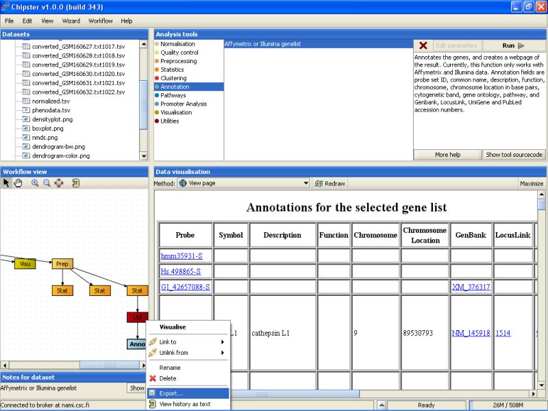
The tool returns an HTML page that contains the annotations for the genes. This page is displayed as a new data set labeled Anno in the Workflow view. It can be visualized by double-clicking it:
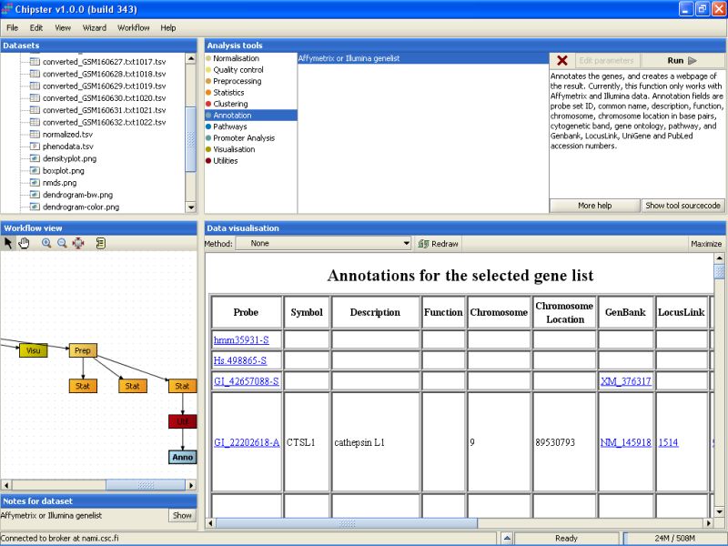
You can click on the links on the page to open them in a www-browser.
In case you want to use the normalized or analyzed data sets in some other programs, you can easily export them. Select the data set from the Workflow view, right-click on it, and select Export from the opening menu:
Browse to the folder you want to export the data set, and press the Save button:
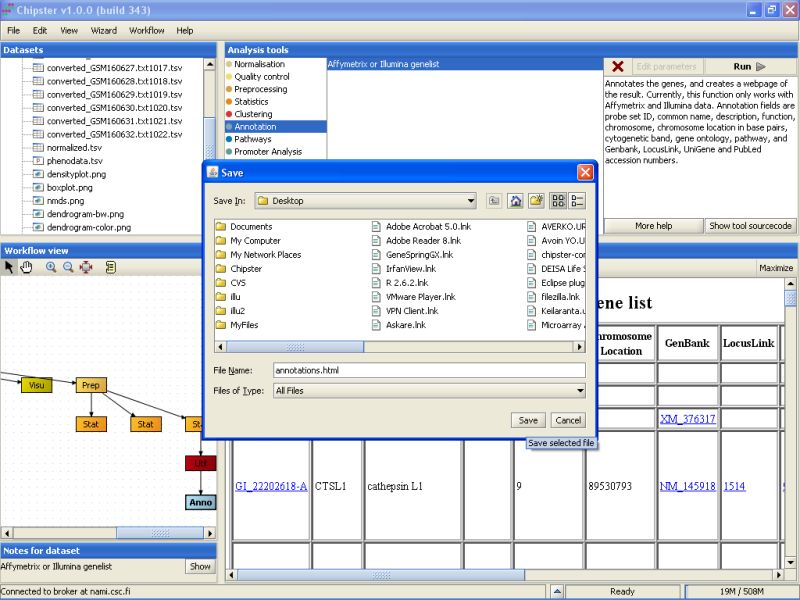
The same method can be used for exporting any other file from Chipster, including the images and the HTML page with annotations.
The story continues in the Tutorial - part II, where we will look into more details about annotations, KEGG pathways, GO ontology term enrichment, promoter analysis, and exporting the data to public databases.